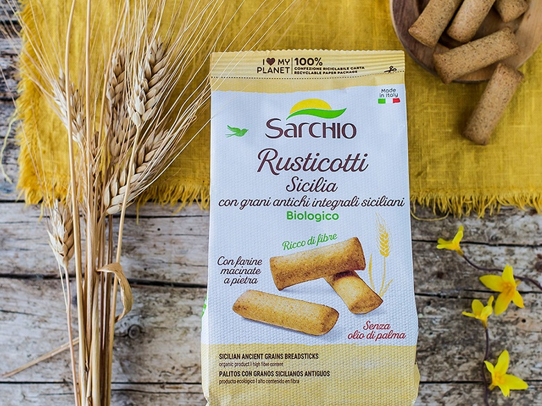
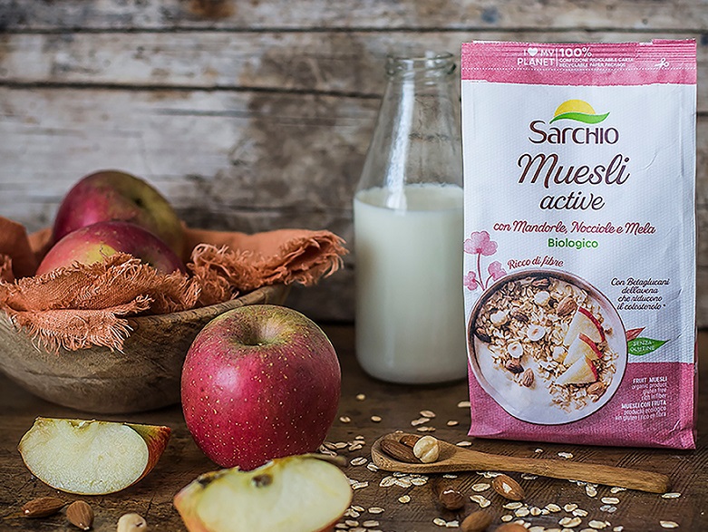
Sarchio, the Carpi company, which has been a reference point for a healthy and natural diet since 1982, presents the new graphic design of its packages: a visual system consistent with the evolution and values of the company that covers the entire range of products and makes each package more original, communicative and attractive.
The new Sarchio package design enriches itself with modern and natural tones accompanied by images, decorative elements and photographic appeal. Also the lettering has been renewed to strengthen the visual impact and make the products more recognisable.
The new design aims to give greater identity and to communicate the company's distinctive values more clearly and directly: the organic nature of the products, which are at the basis of its DNA, the respect and enhancement of nature as well as the company's concrete commitment to environmental sustainability.
On each recyclable packaging on paper the symbol "I love my planet" appears clearly visible, which reassures the buyer on the complete recyclable nature of the packaging and emphasises Sarchio's strong commitment to the planet. The restyling includes 5 main clusters based on the different types of product and specific communication needs. The first cluster includes the most innovative and healthy products, such as the new line of functional muesli, bars, biscuits and sweet and savoury snacks.
The second cluster includes more traditional products, such as flour, baked goods and gluten-free mixes.
The chocolate line is the main character of the third cluster. For this category of products alone, the Sarchio logo abandons the two institutional colours and is enriched with gold plates that convey refinement and value. The simplicity and nature are obtained by the photographic images in the background, the packaging is characterised by a few colours that alternate with texts written with linear and essential font types.
Simplicity, flat colours and transparencies prevail in the fourth cluster, which includes the Sarchio pasta range.
Finally, the fifth cluster concerns all the products in glass in which one wants to communicate their artisan quality and premium positioning. The packages are characterised by large monochrome backgrounds in shades of brown that give homogeneity and recognisability to the entire product line.
"Our goal is to enhance the variety of the Sarchio offer, making each package more communicative, original and characterised by a precise identity. The new package design is characterised by colours, illustrations and graphic styles that enhance the perception of the product in a coherent and more recognisable visual frame. In addition, the new identity is in line with the Sarchio target for 2020: to minimise the impact of packaging on the environment. This is why we have chosen greener materials for our packages, a 100% recyclable paper packaging recognisable by the "I love my planet" logo, which confirms Sarchio's great commitment to the planet", commented Sandra Mori, Marketing Manager at Sarchio.